The design journey began with broad brainstorming and visual exploration. I sketched dozens of directions—mountains, waves, compasses, paths, Canadian icons, and letterforms—capturing the many layers of what True North Journeys represents: exploration, culture, and nature.
From this wide exploration, I focused on merging the initials TNJ into a single, simple, and recognizable form. I experimented with geometric “N” shapes, horizon lines, and abstract wings, constantly testing how the letters could hold both functional clarity and symbolic meaning.
The breakthrough came with the idea of wings—a direct connection to Canadian geese, a universal symbol of travel, migration, and freedom. By shaping the initials into wing-like forms, the logo became more than a mark: it became a story. A story of movement, guidance, and journeys taken together.
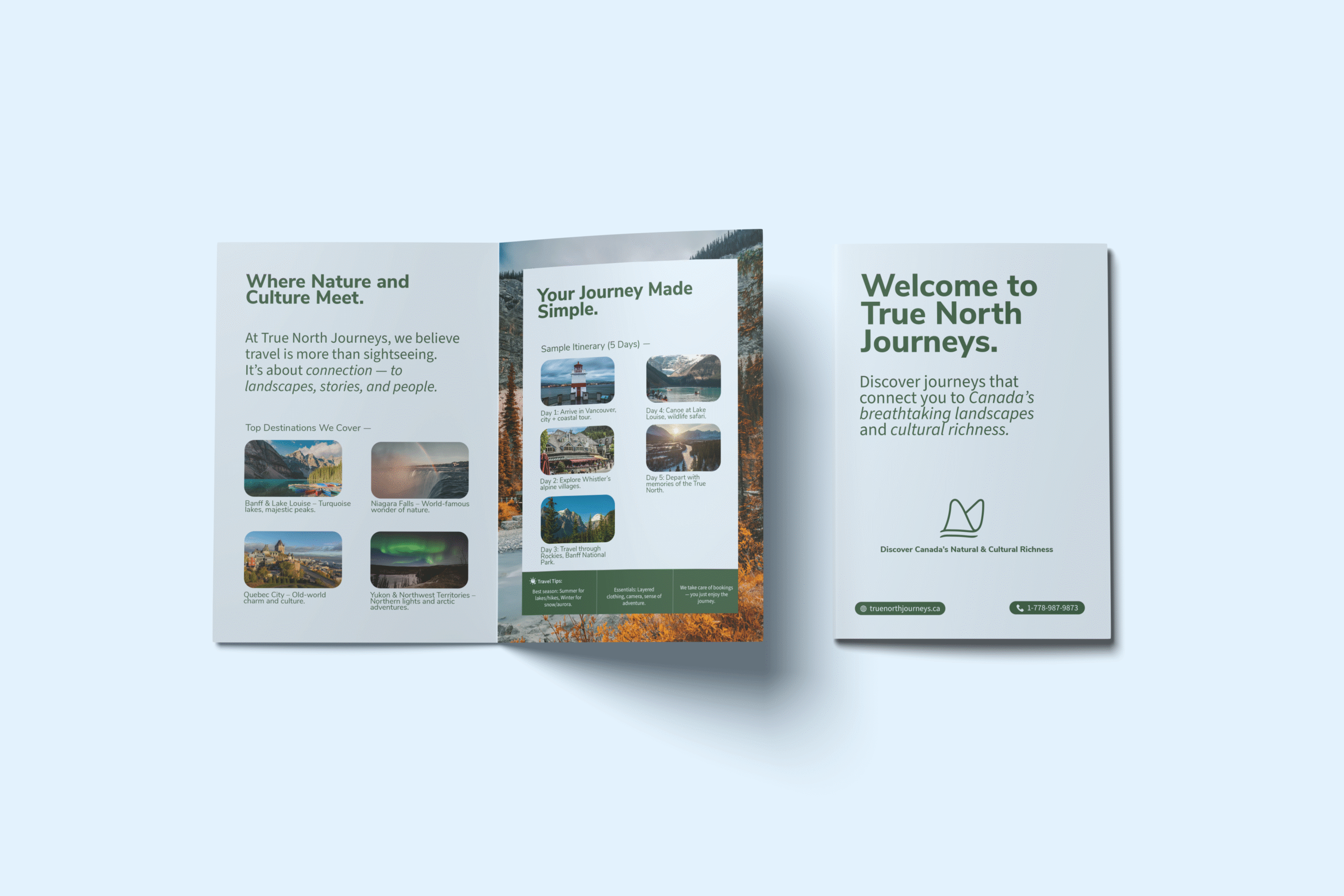
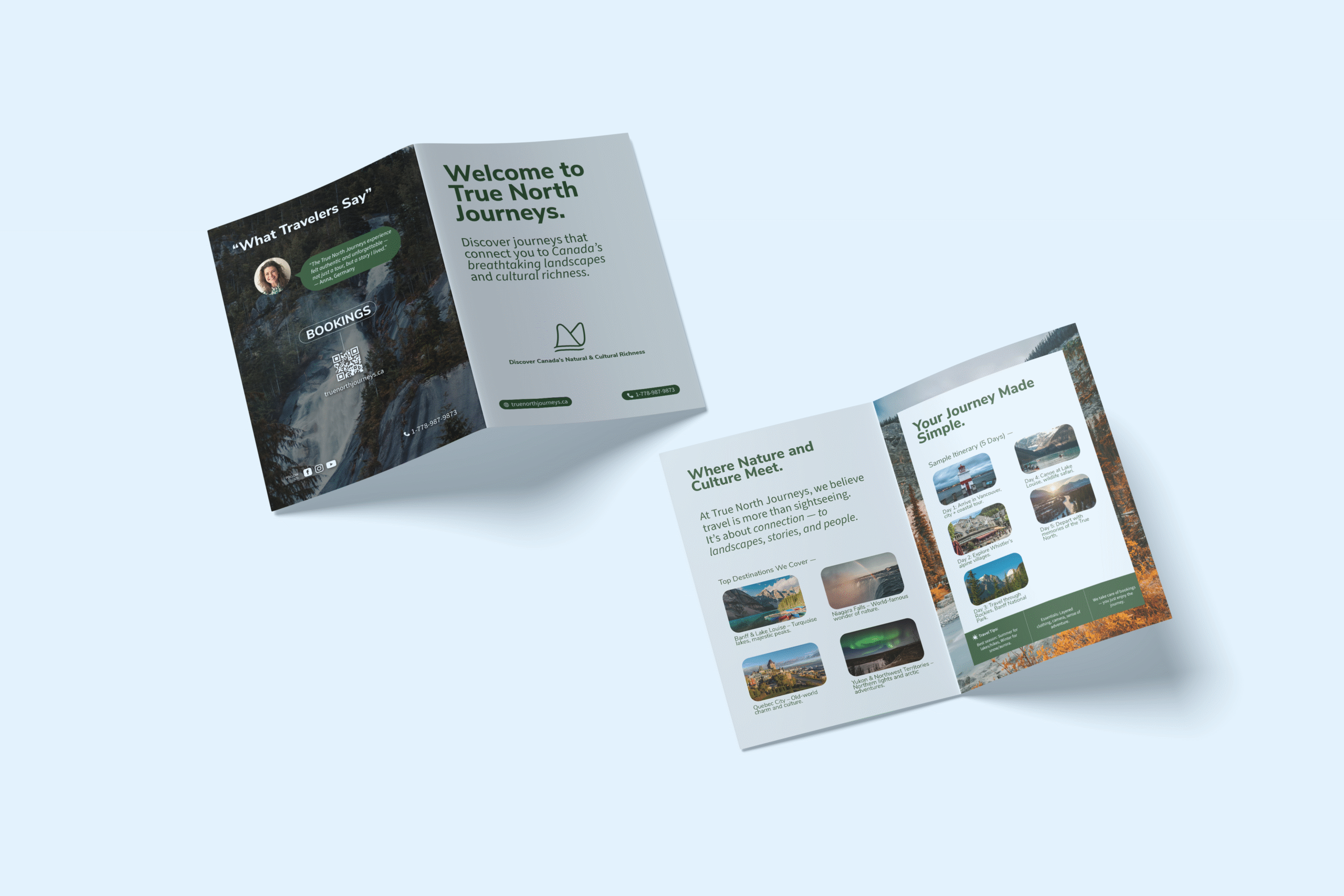
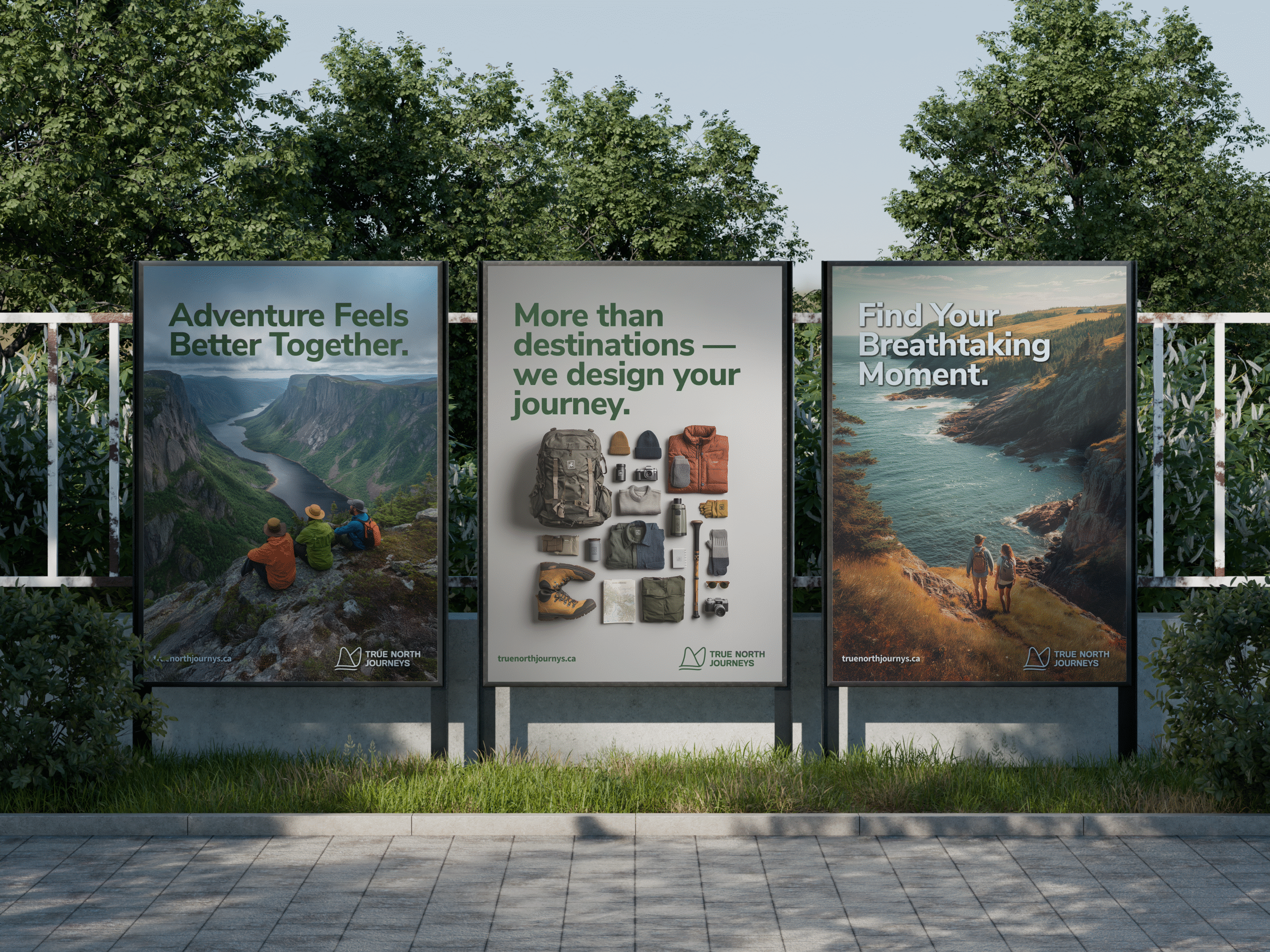
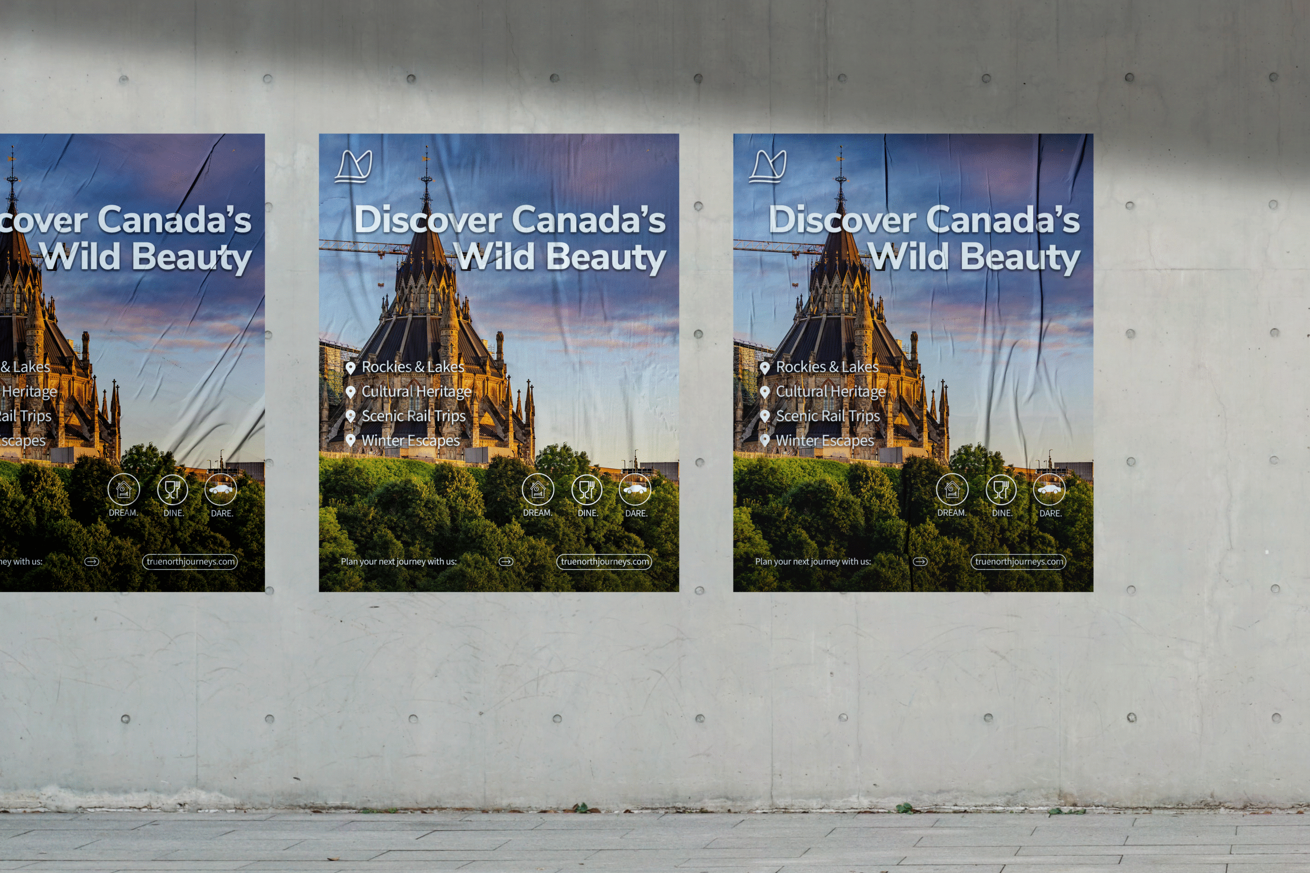
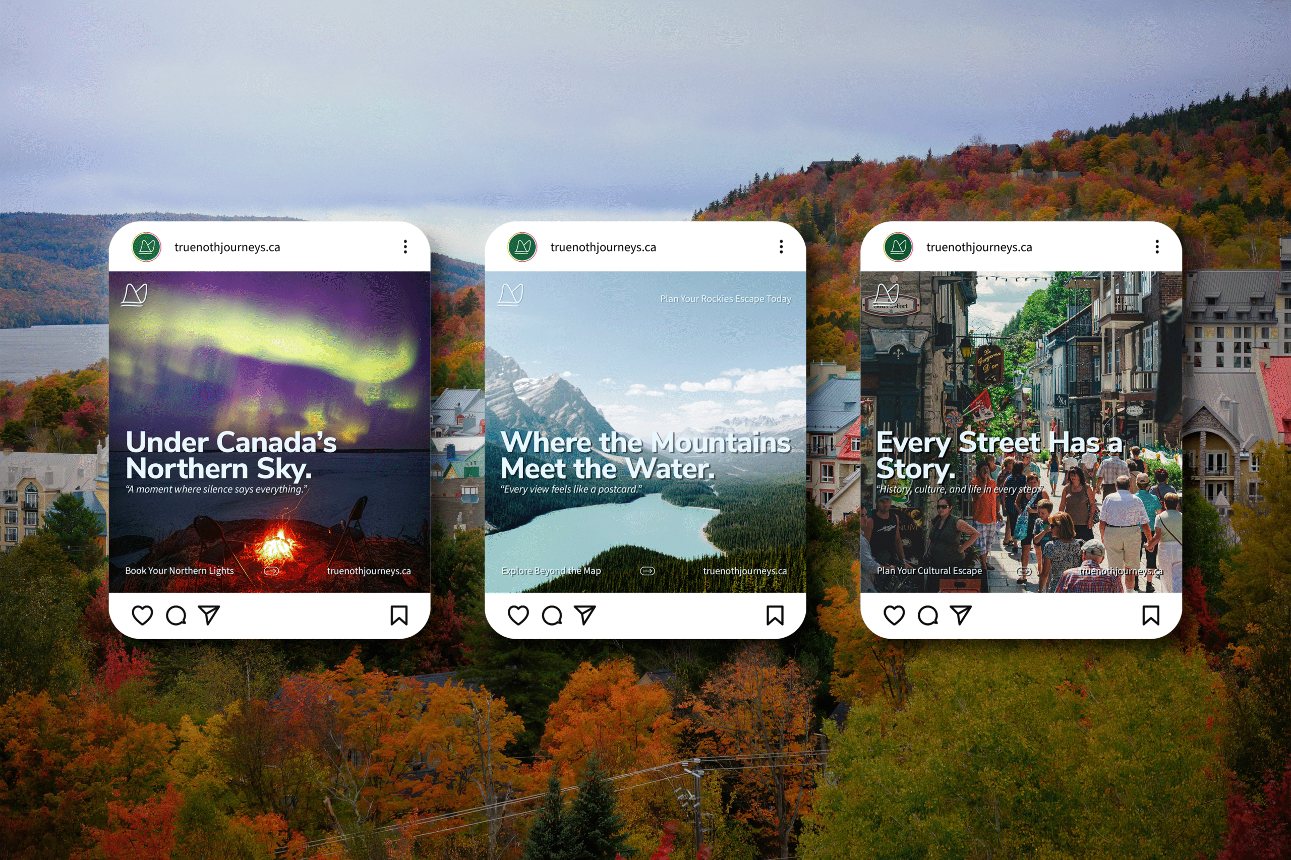
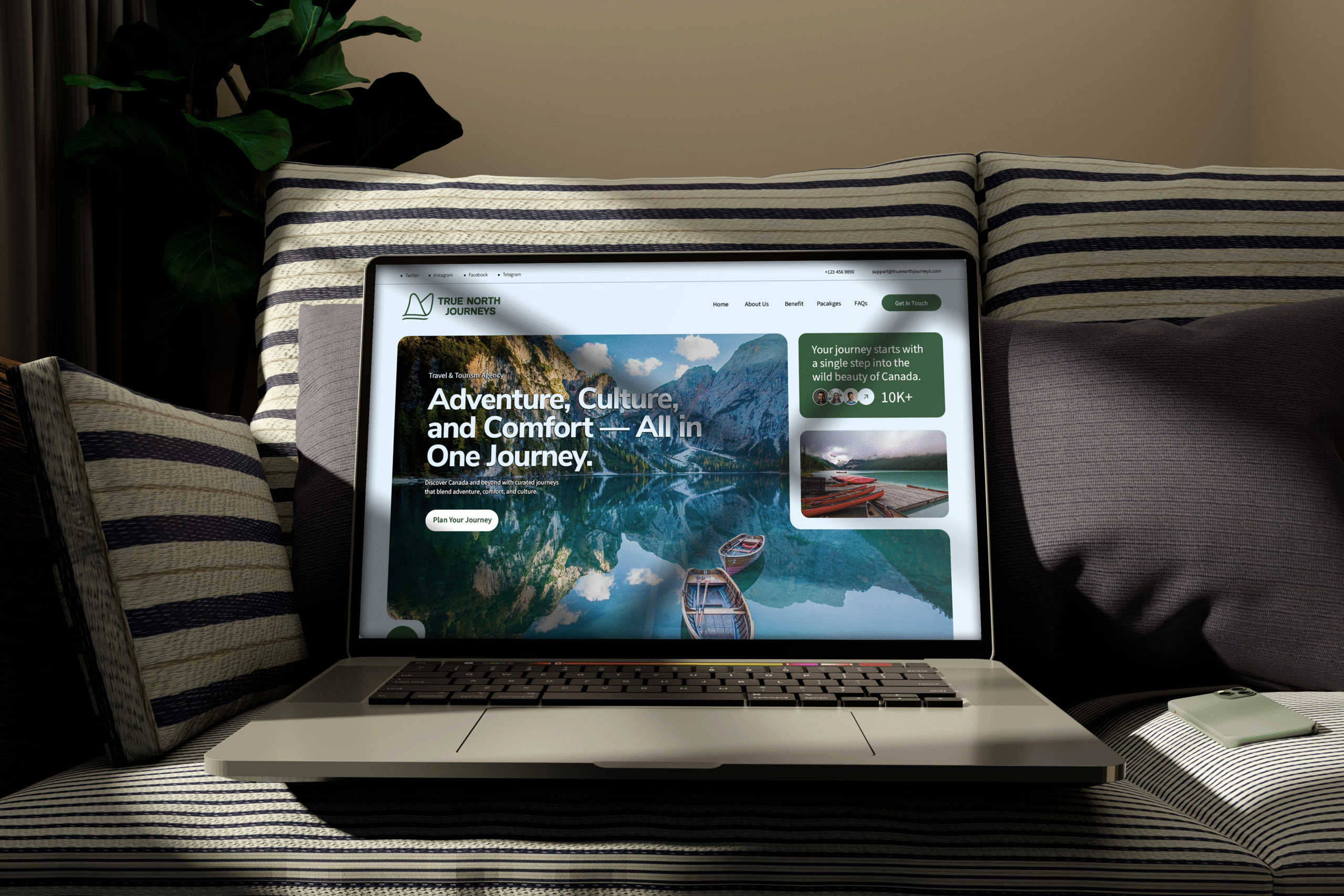
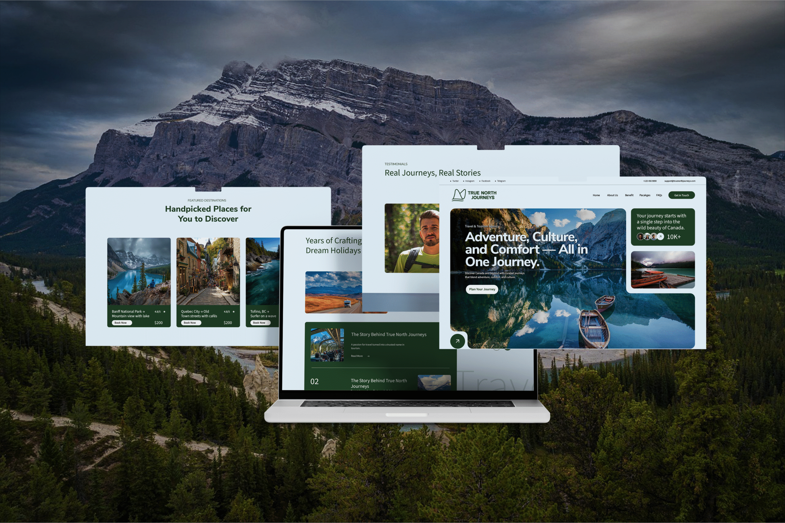
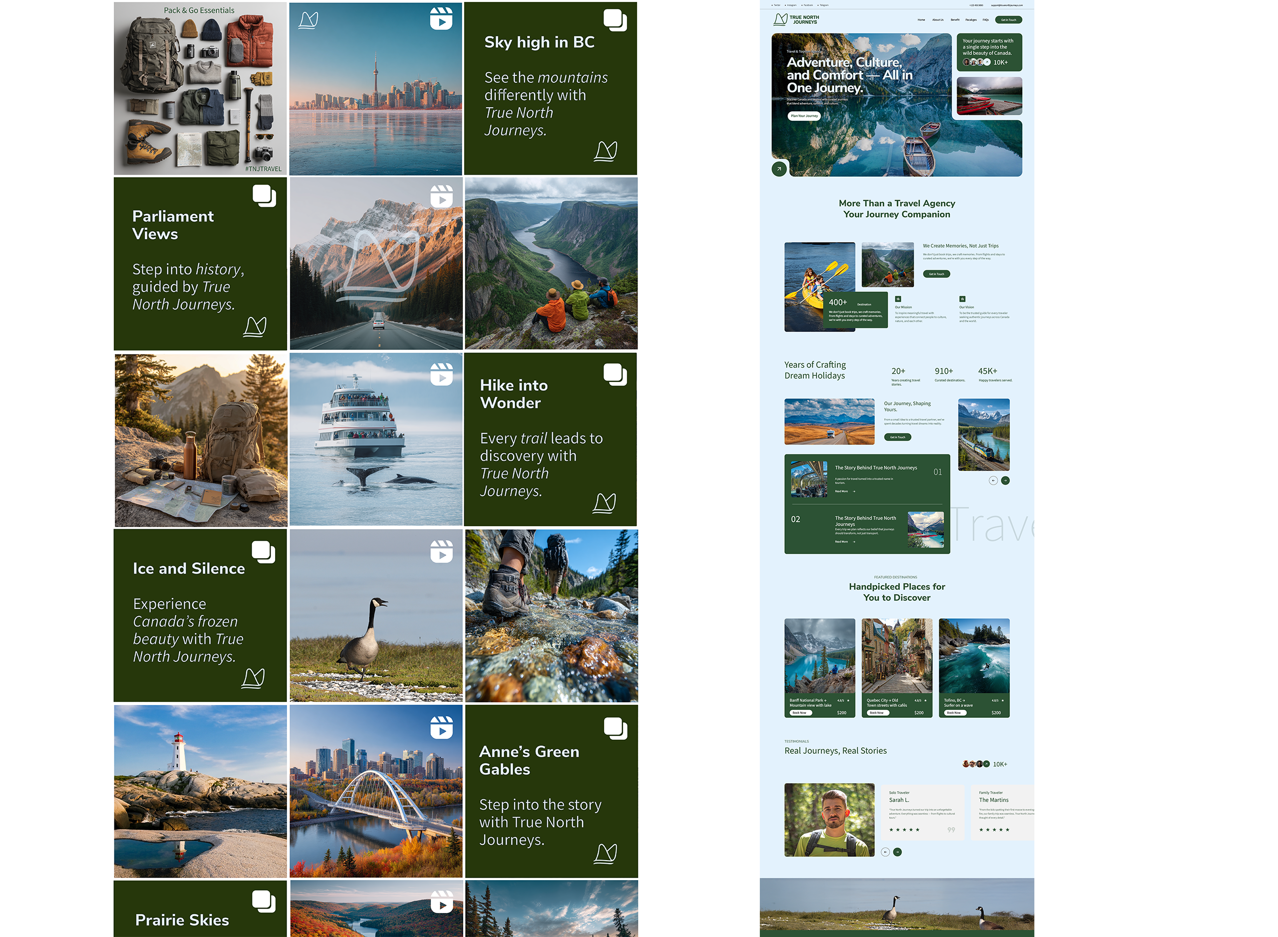
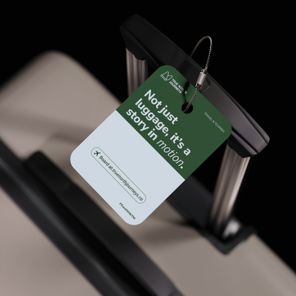
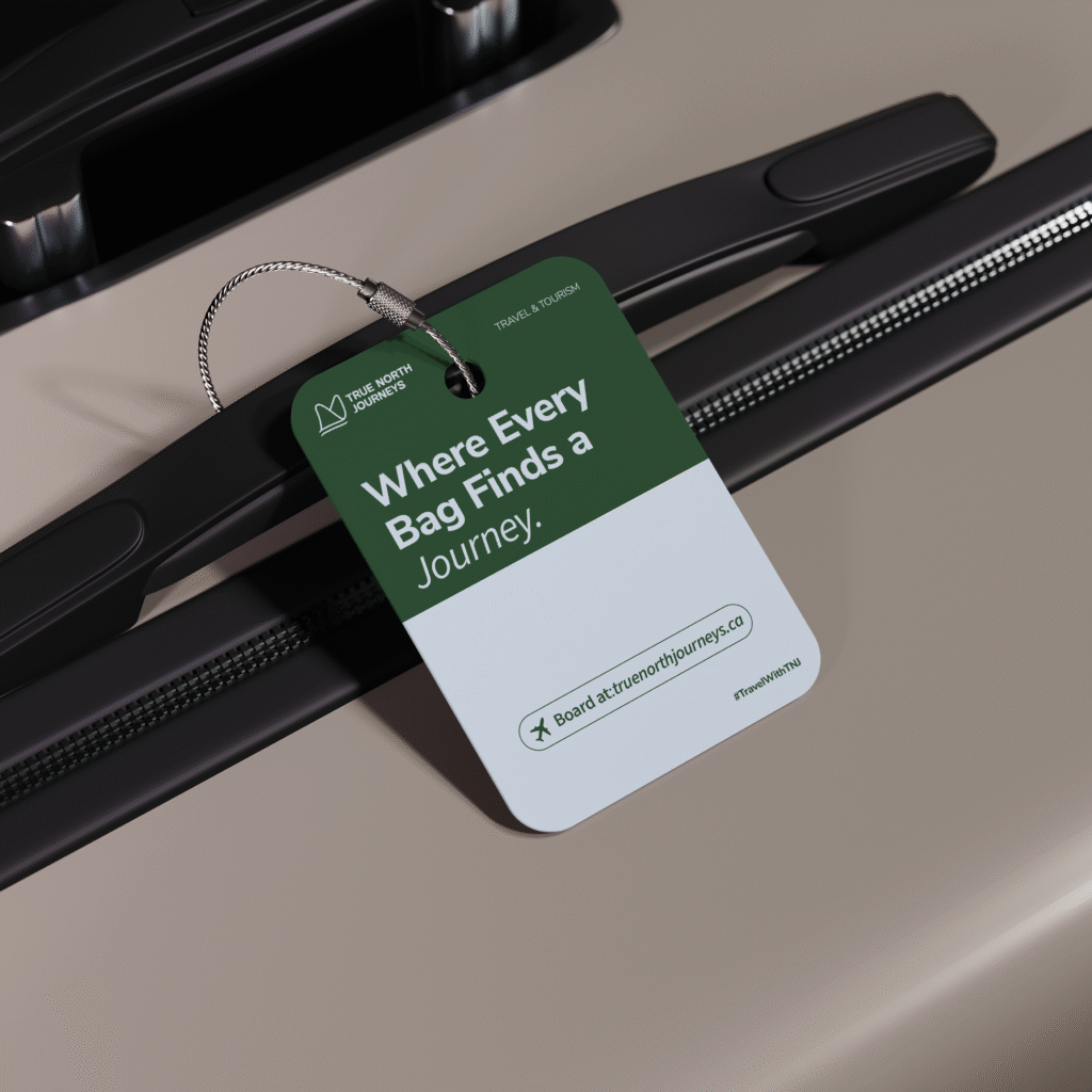
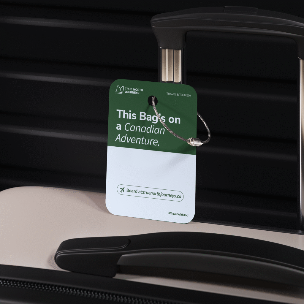
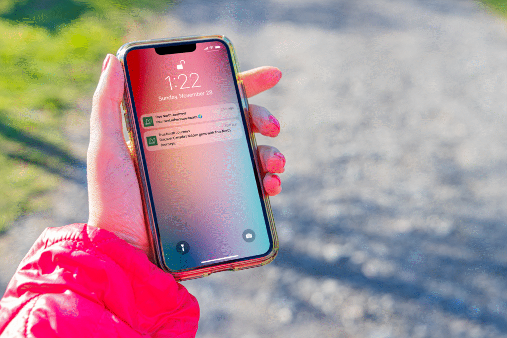
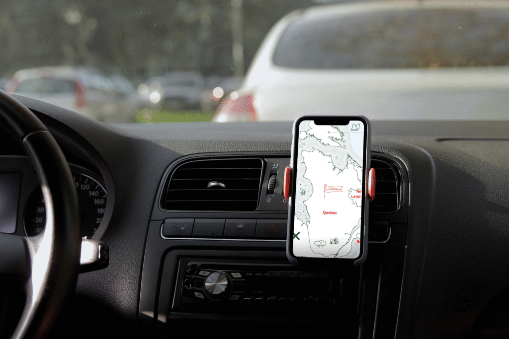
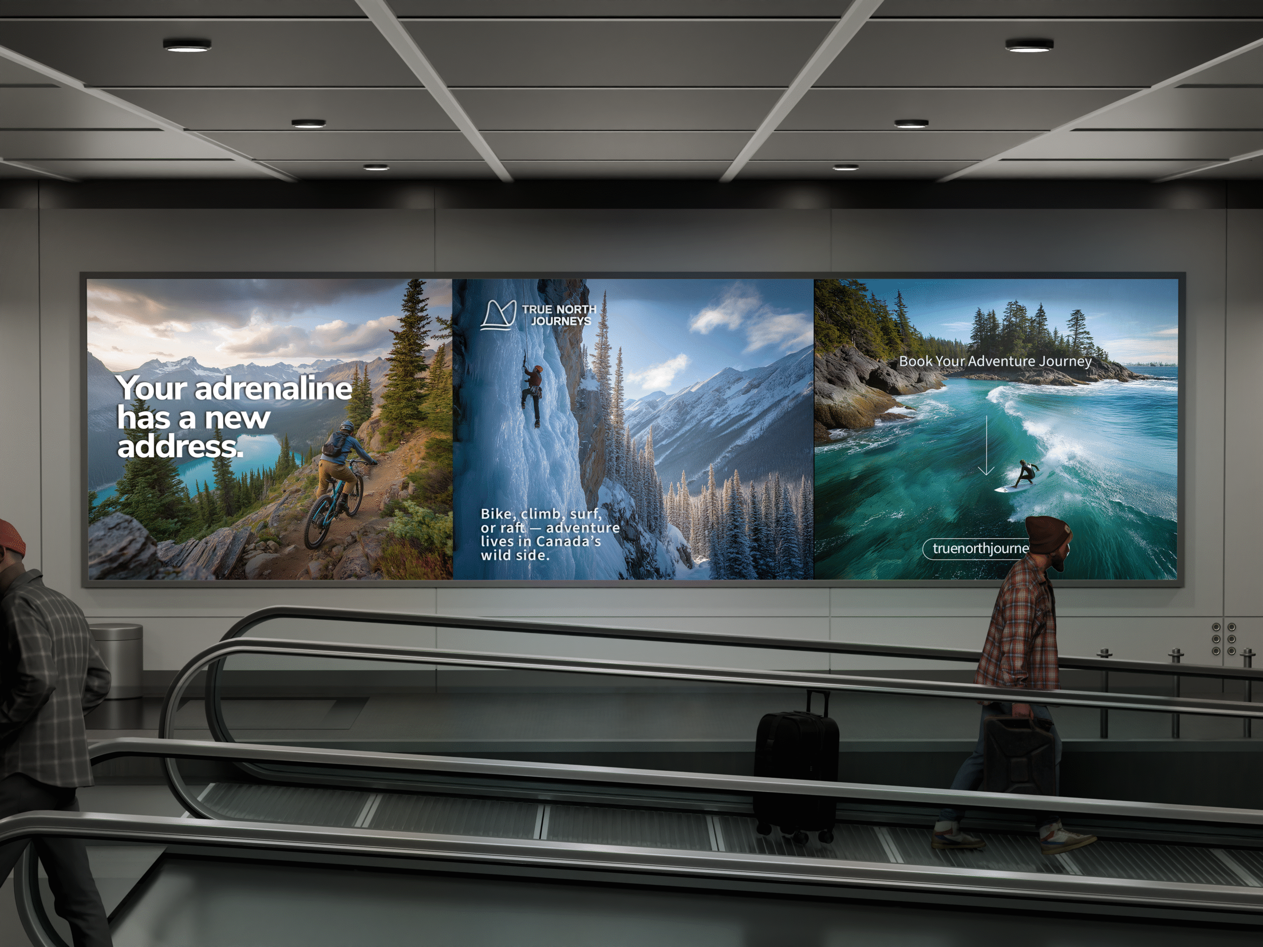
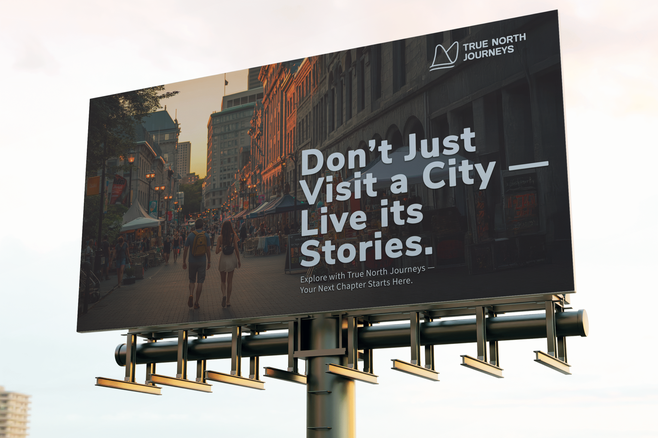
Once the core symbol was established, I refined it for scalability and flexibility. I ensured the design worked seamlessly across all touchpoints: billboards, posters, digital ads, social platforms, and even wearable tech like smartwatches. Alongside the logo, I built a full identity system—typography, colors, and campaign templates—that allowed True North Journeys to not just market destinations, but to inspire stories and emotions at every interaction.