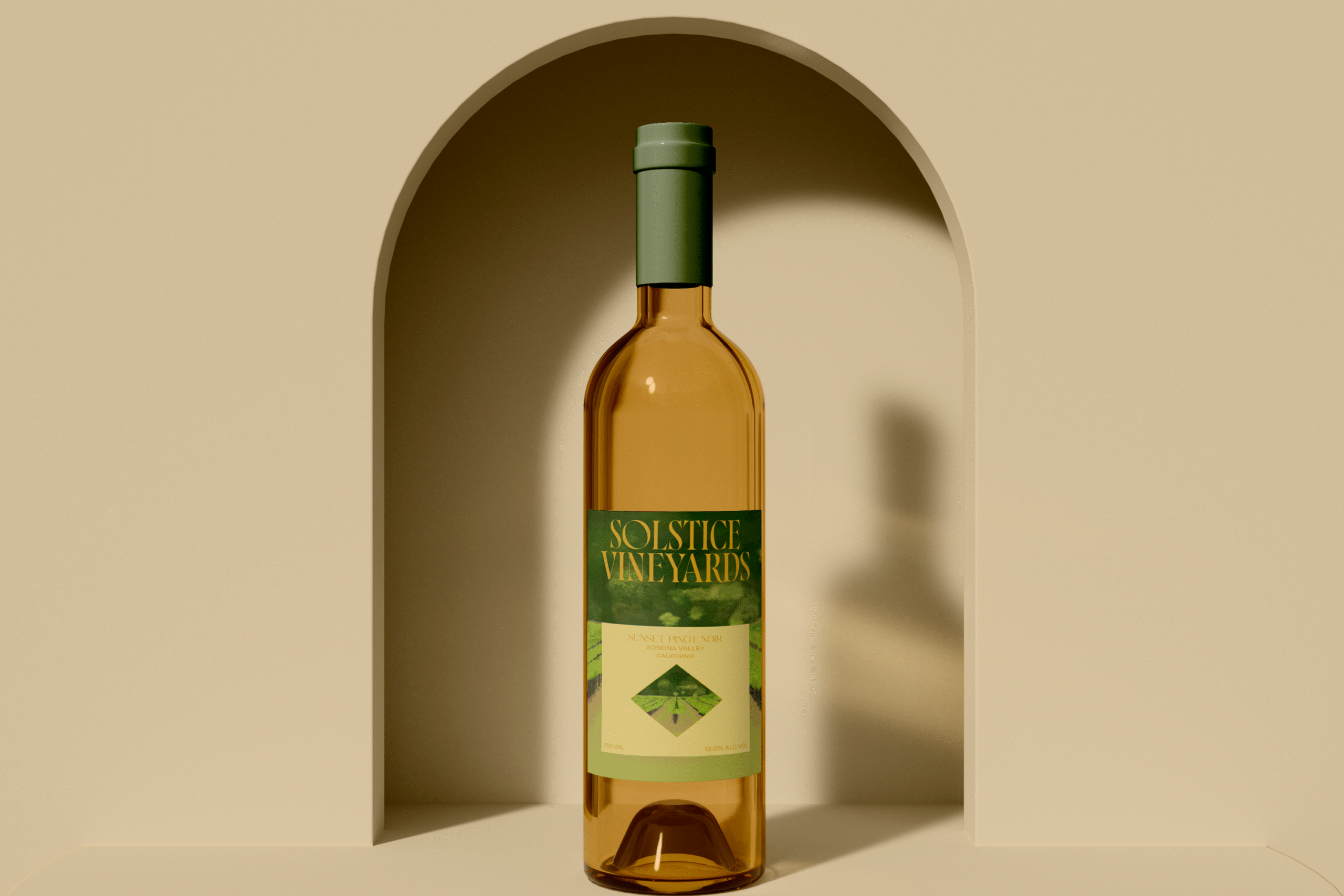
Solstice Vineyards
Brand Strategy | Visual Identity Design | Illustration | Packaging Design
A premium organic winery from Sonoma Valley, blending sustainable winemaking with elegant, art-inspired branding.
Challenge
Solstice Vineyards needed a refreshed brand identity that reflected their core values—elegance, sustainability, and artisanal craftsmanship—while appealing to both wine connoisseurs and eco-conscious consumers. Their existing visuals lacked the emotional connection and luxury feel needed to stand out in a competitive premium wine market.

Solution
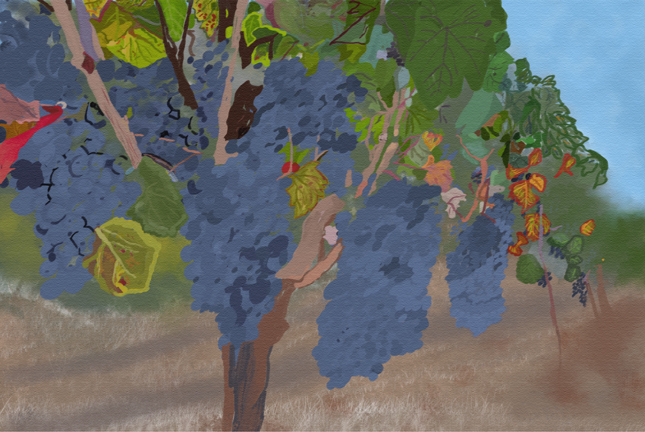
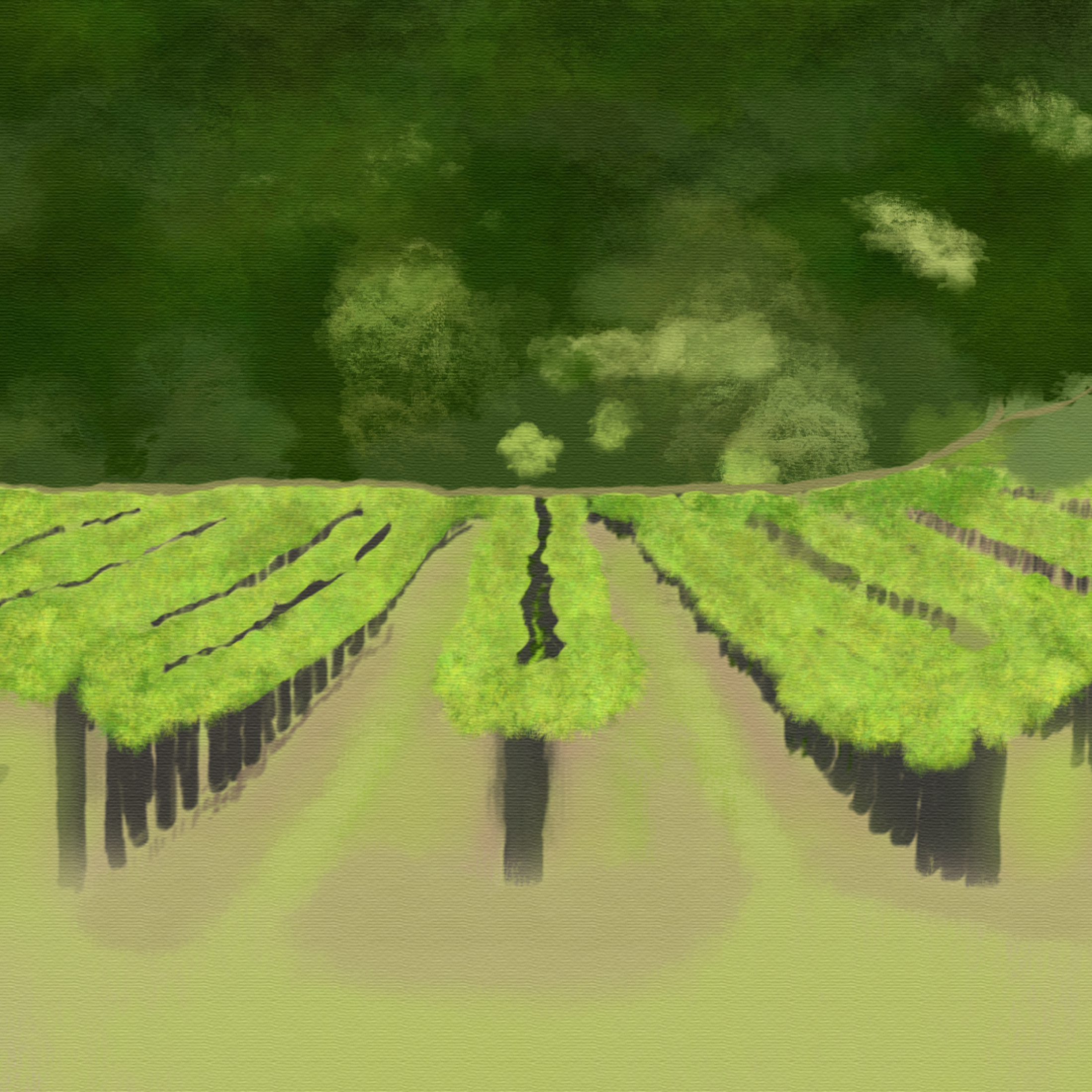
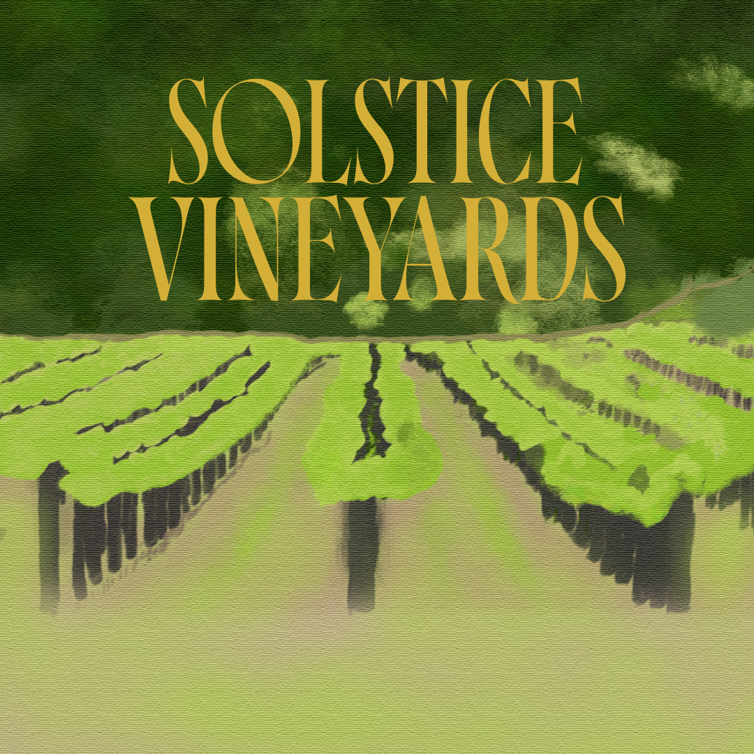
I designed a sophisticated brand identity anchored in hand-painted vineyard illustrations, a refined serif logotype, and an earth-toned palette accented with gold for a touch of luxury. My approach highlighted their organic practices and the natural beauty of Sonoma Valley.
Process
Research & Strategy – I analyzed the premium wine market, sustainable wine brands, and the preferences of the target audience.
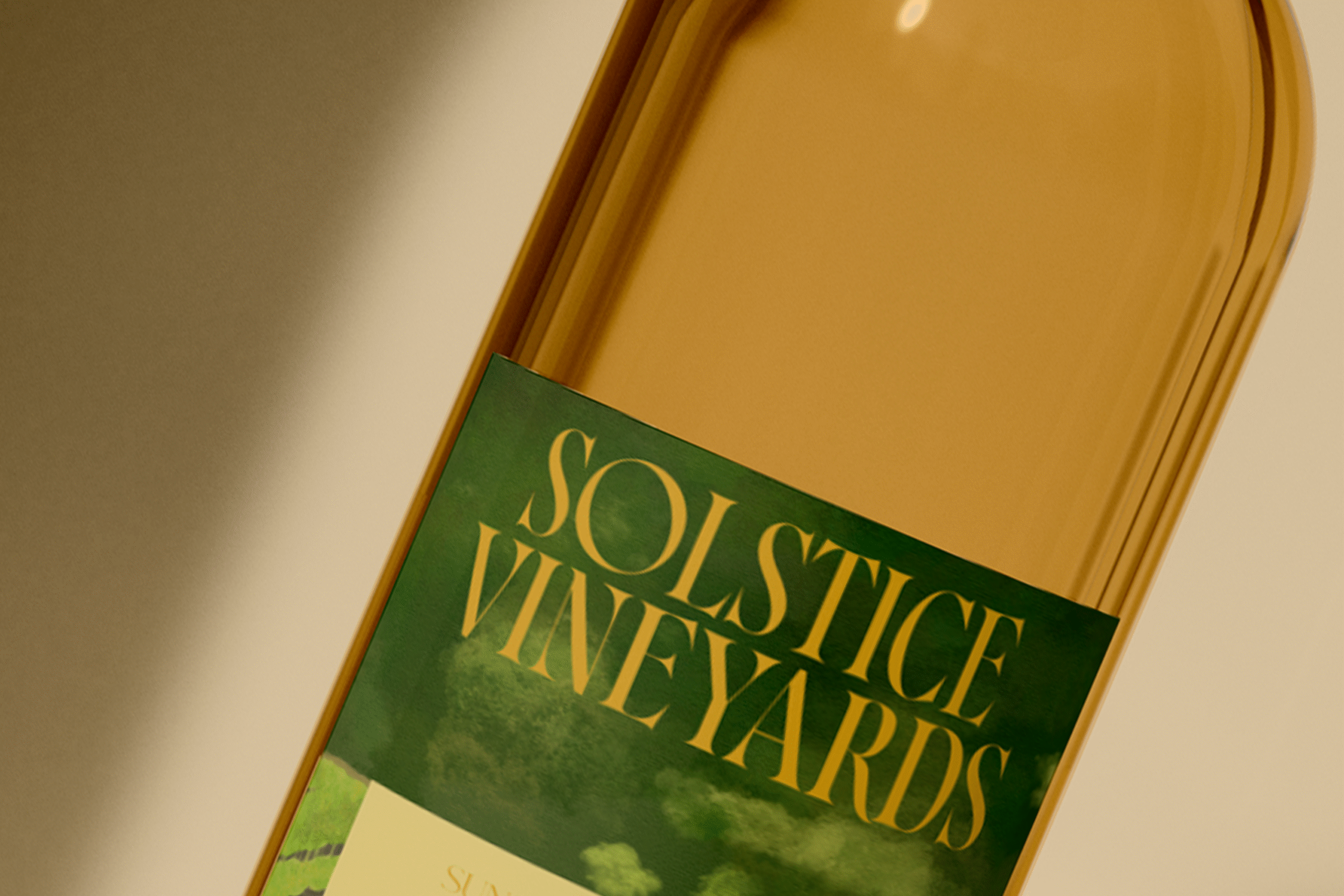
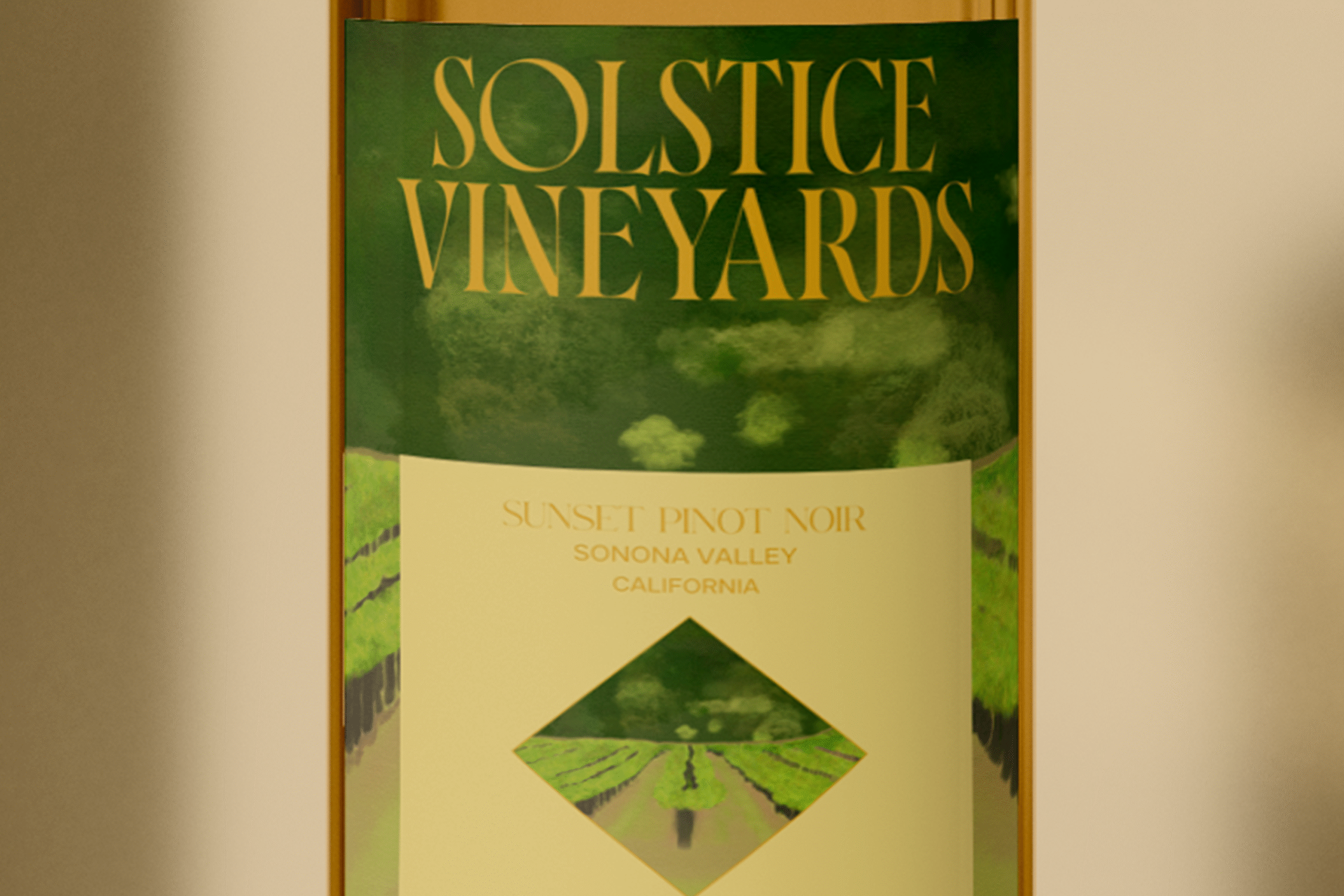
Brand Identity Development – I crafted a custom serif logo inspired by heritage wine labels and integrated vineyard illustrations to create an artisanal, tactile feel.
Color & Typography Selection – I curated an earthy, muted palette (greens, purples, golds, ivory) paired with classic serif headings and clean sans-serif body text.
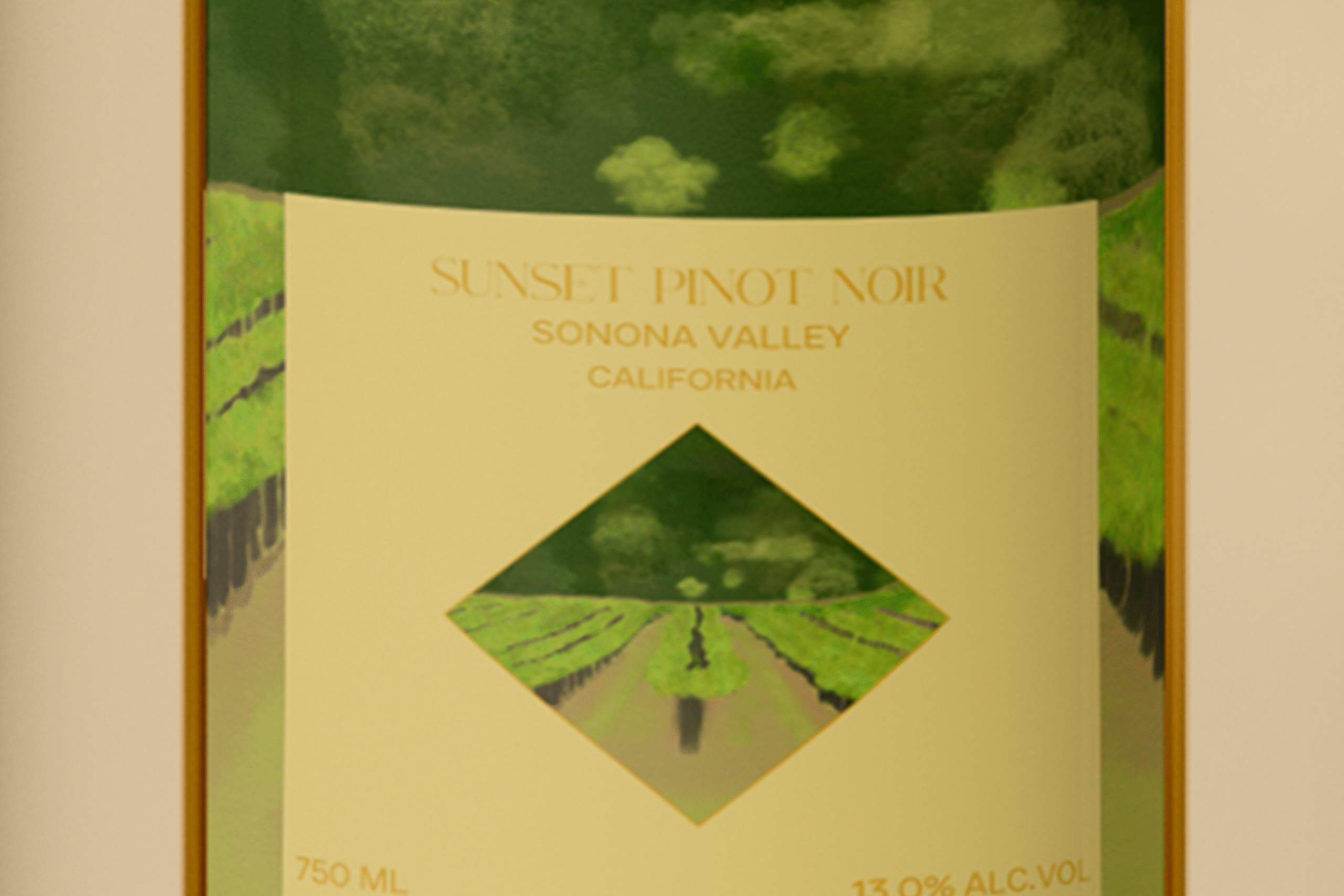
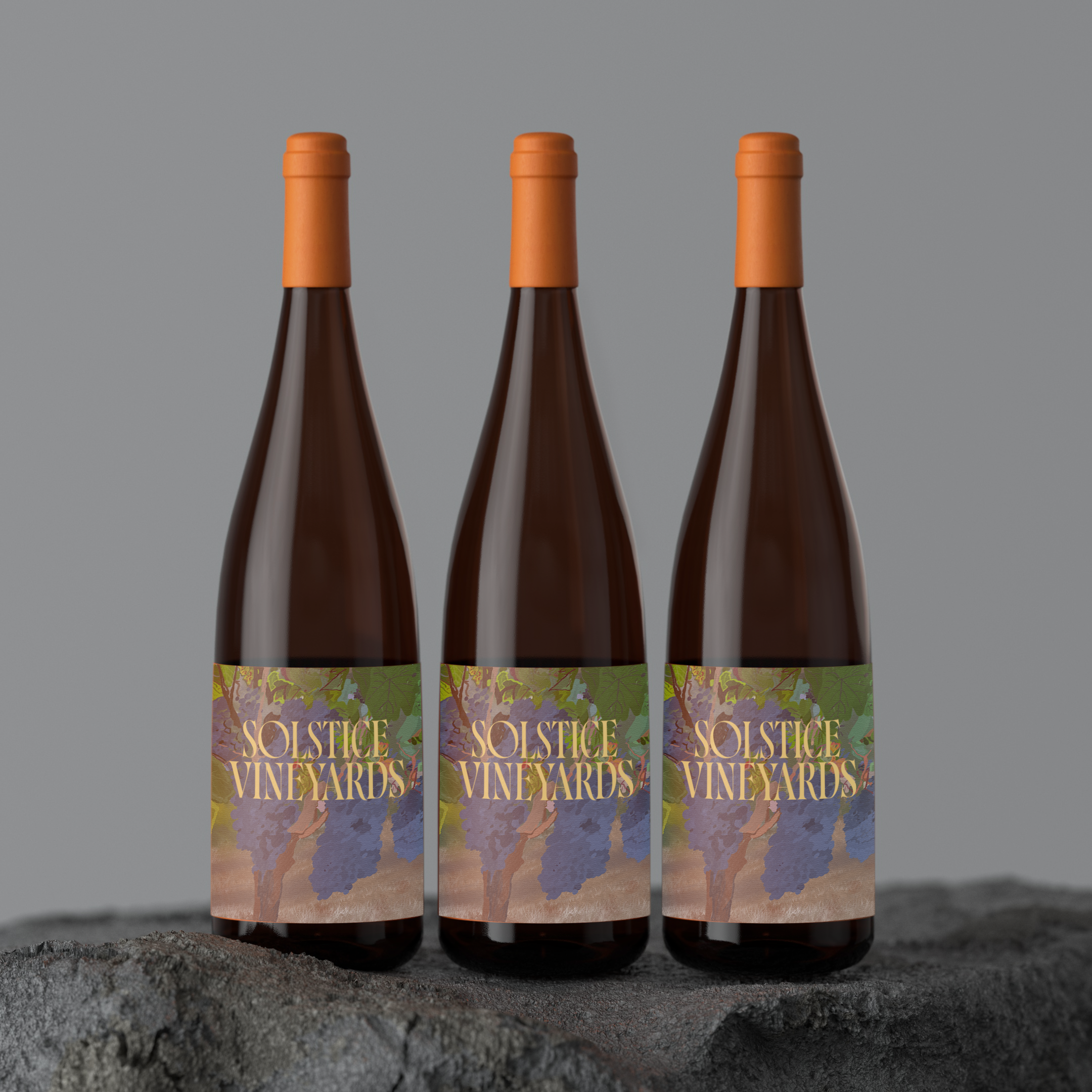
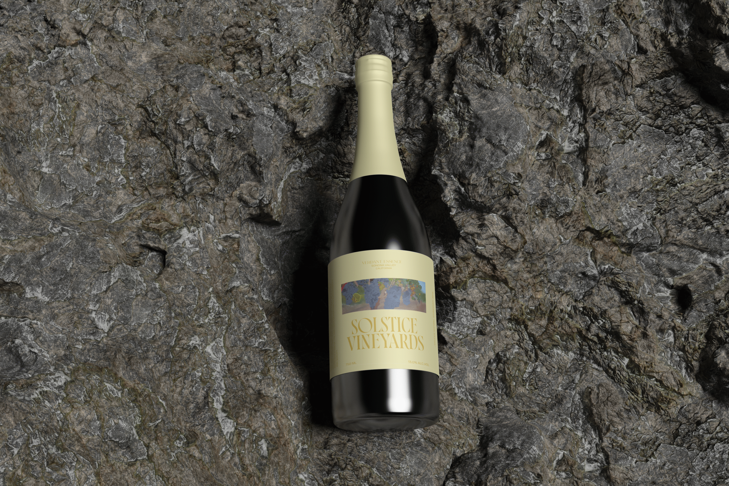
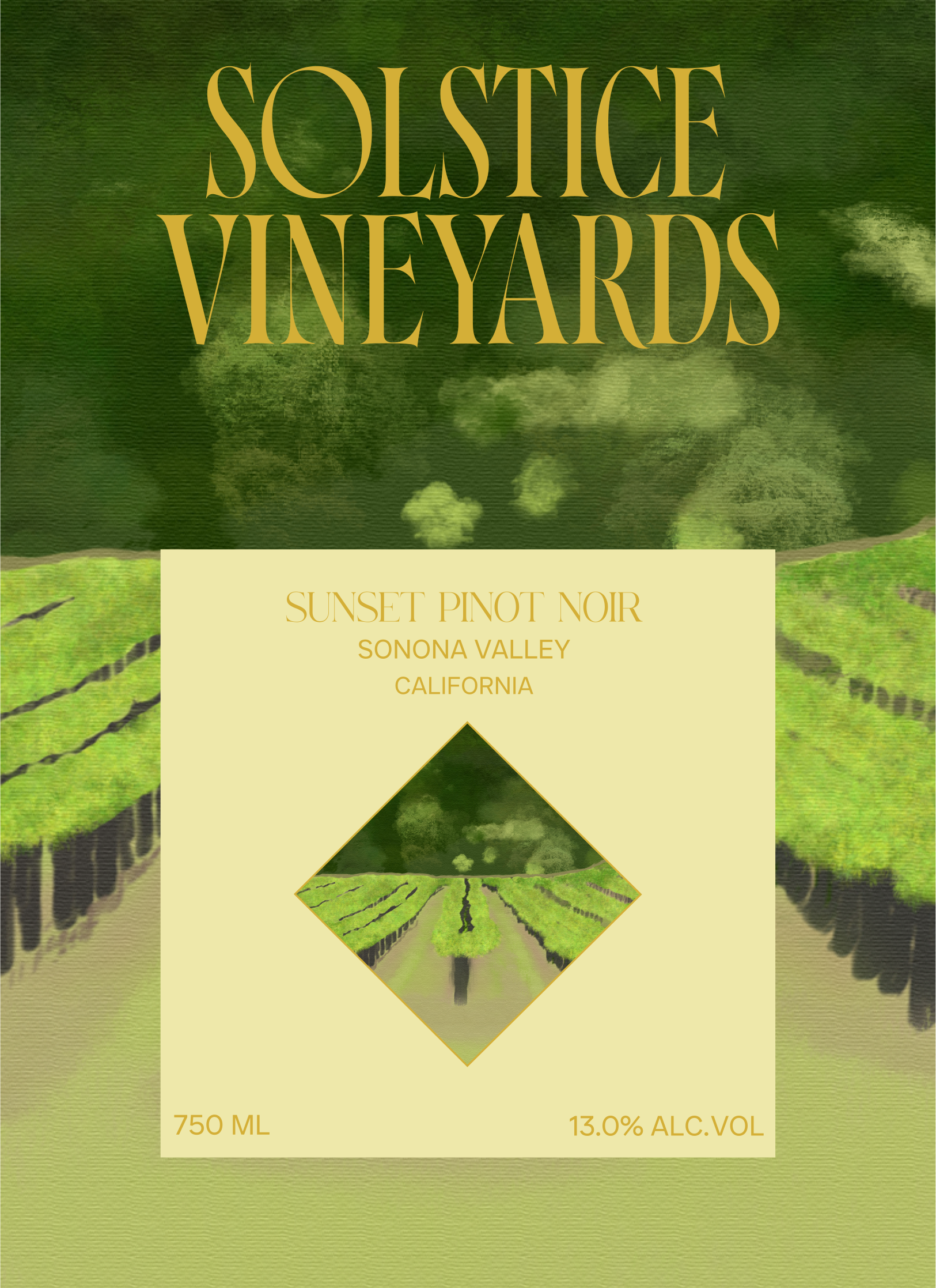
Packaging Design – I designed wine labels with painted grapevines, paired with clean layouts for readability and premium shelf appeal.
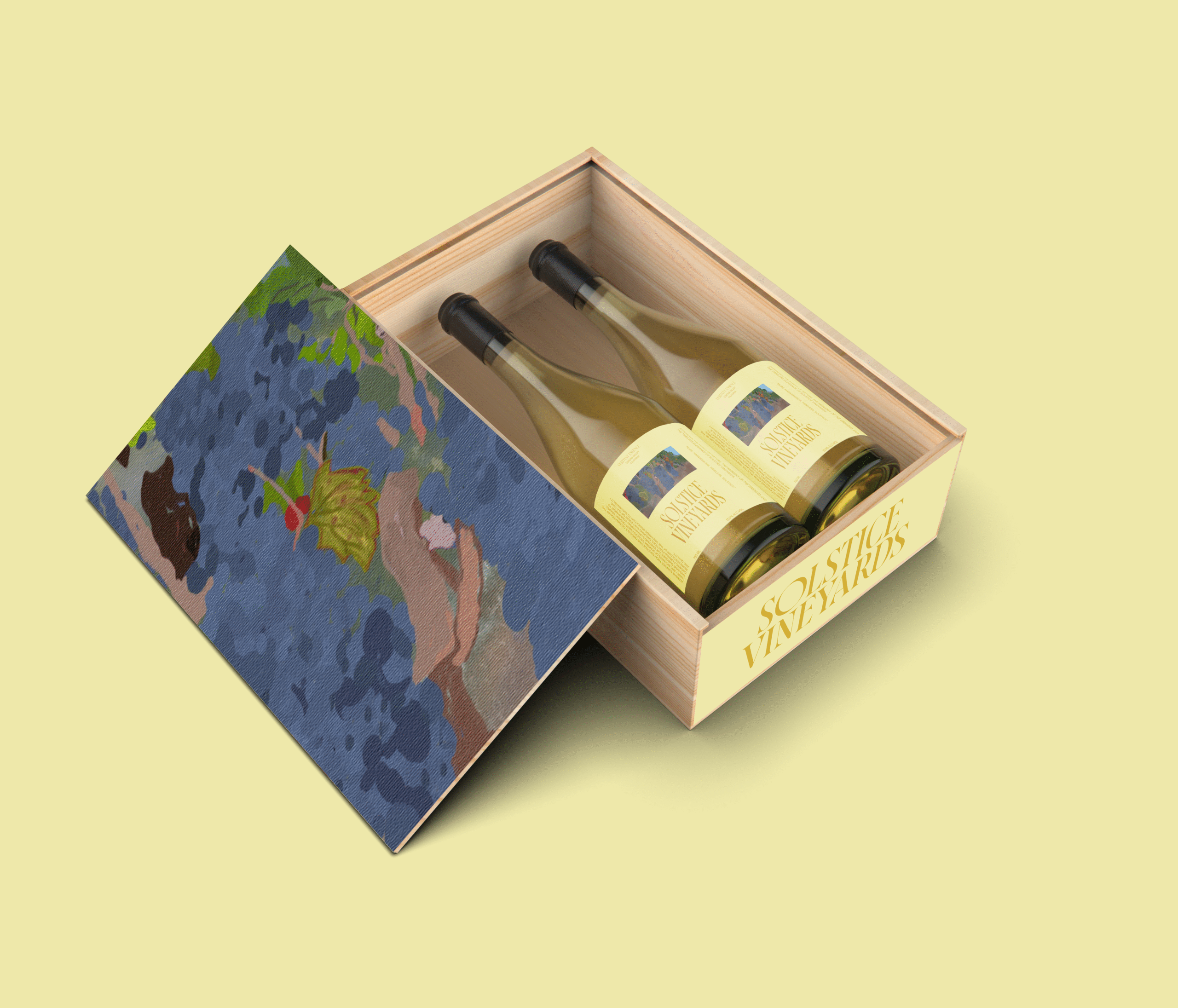
Mockups & Presentation – I created realistic bottle shots, box set mockups, and lifestyle images to present the brand across both retail and digital channels.

Label Design
Impact
Elevated Perception – My designs positioned the brand as a true premium, sustainable winery.
Stronger Storytelling – The vineyard imagery and sustainability focus allow customers to connect emotionally with the brand.
Market Differentiation – The hand-painted style and elegant typography stand out among competitors.
Sales-Ready Assets – The packaging, website concept, and mockups are ready for retail, e-commerce, and promotional campaigns.
